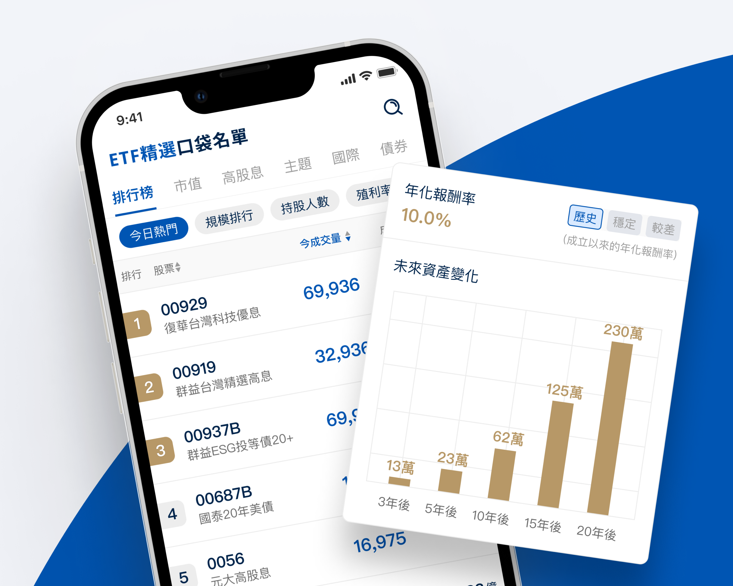
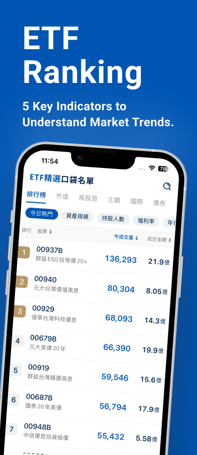
Increasing WAU by 52.9% by adapting to user feedback
Client: Taishin Securities
Company / Product
CMoney / ETF Choice
Role
Product Designer
Timeline
2023 Oct - 2024 Jun (9 months)
Team
Product Manager
UX Researcher
Product Consultant
Skills
Interface Design
Cross-functional Collaborating
Usability Testing
Survey Design
Wireframing
Our Mission
Continually optimize ETF’s data and user experience to become the #1 go-to app for buy-and-hold ETF investors.
Result
Weekly Active Users
52.9%
Weekly Downloads
45.0%
What I did (with PM)
brainstormed and discussed frequently to optimize our previous UI and product features.
clarified product positioning & target audience together
What I did (with UXR)
conducted usability testing within the company to verify usability problems.
conducted in-app surveys to understand what data investors value the most.
What I did solely
Invested on ETFs with real money to understand user needs
Kept track of user feedbacks over time from in-app survey and app store reviews
Surveyed different financial apps for inspirations on how to improve the UI
Research Insights
based on Usability Testing, In-app Survey, Feedback Form and App-Store Reviews
# 1
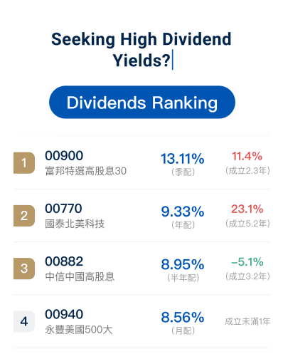
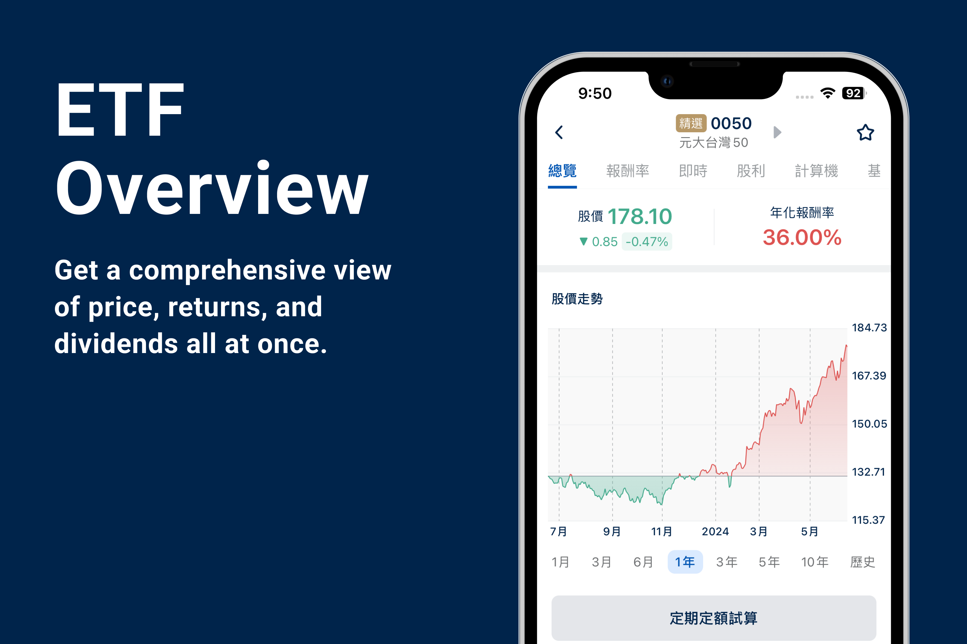
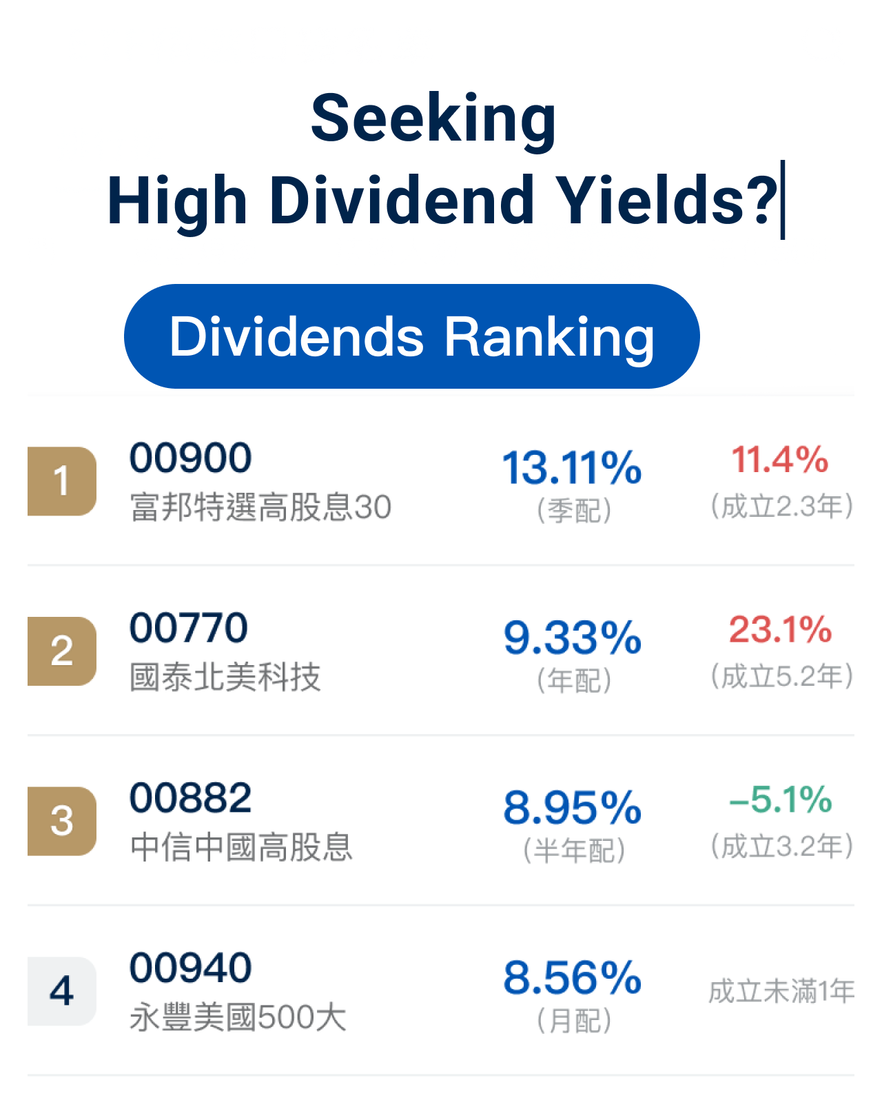
Offering desired fields for different ETF categories in the app will make it more intuitive.
Originally, the page was divided into “Recent Performance” and “Basic Information” using tabs. However, users interested in market-cap ETFs want to see recent performance, while those focused on high-dividend ETFs look for yield and basic information. Using tabs not only risks being overlooked by users but also makes the information less intuitive.
# 2
The MVP version needs better information to help users make decisions.
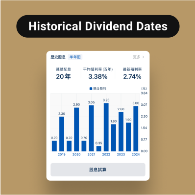
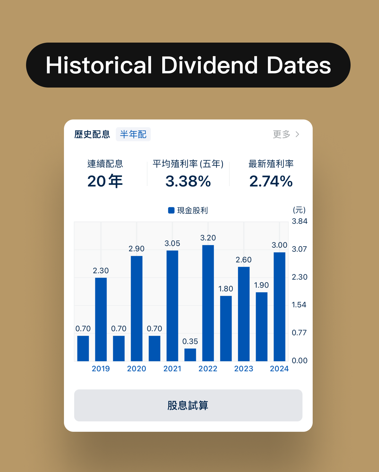
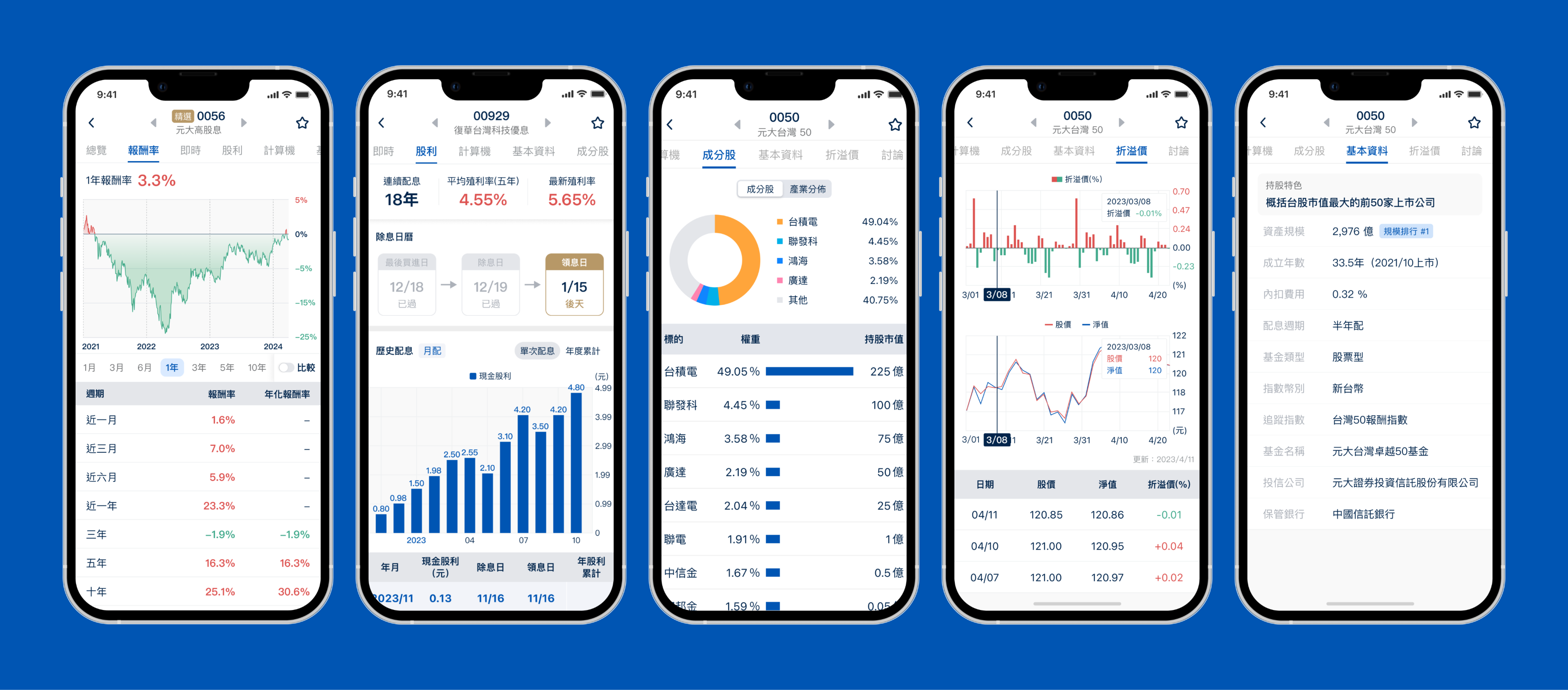
After reviewing user feedback, we discovered that details like historical ex-dividend dates (歷年除息日), net asset value (淨值), premiums/discounts (折溢價), custodian banks (保管銀行), and number of beneficiaries (受益人數) are key factors for users when analyzing ETFs.
# 3
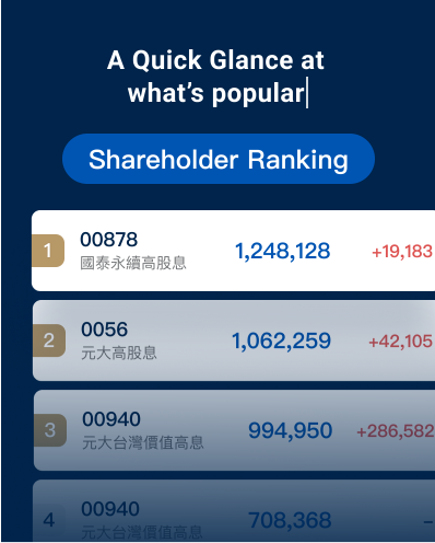
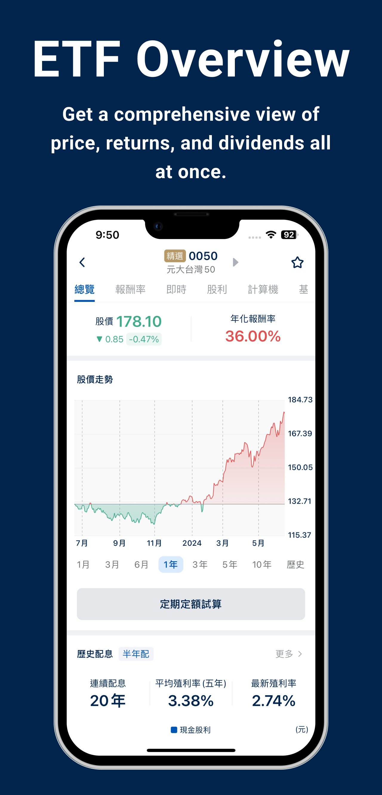
Originally, the ETF focused on calculator functions, but these functions do not encourage users to return frequently.
#4
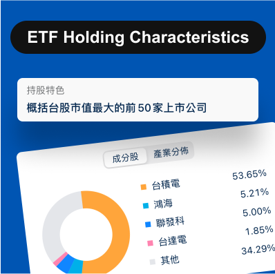
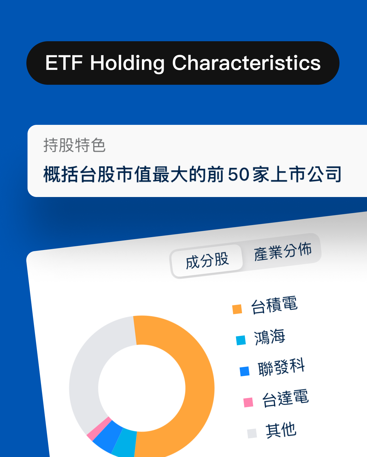
The characteristics of an ETF's holdings can't be inferred from its name.
Challenges
During the product revamp, I faced several challenges and sought solutions to resolve them.
The product team only had a rough idea that the ETF Choice App is aimed at ETF newbies, but how new exactly? We weren’t sure...
So, I approached the PM and discussed with him to clarify who we are designing the app for, and we reached a consensus.
Problem Solved!
Who’s our target audience?
Investors who are:
Only familiar with popular ETFs like 0050 and 0056.
Know what an ETF is but don't know which ones to buy or how to choose
(unable to distinguish between good and bad ETFs)
Regularly investing a fixed amount and understanding asset allocation, but only investing in a few specific ETFs.
Completely new to investing in ETFs and just getting started.
Someone who is well-versed in various types of ETFs and all kinds of indicators.
I experienced a long 5-month wait before the second version of the product was launched due to limited engineering resources, which made the process quite frustrating and left me feeling unfulfilled....
Knowing I should make use of the wait rather than feel unfulfilled, I asked the PO if I could conduct UX research during that time, so we could use the findings to support our optimizations.
Problem Solved!
Design Results
In-App surveys
I collaborated with UXR to design and launch in-app surveys in both the ETF choice app and the company’s largest trading app, ChipK, to understand users' ETF investment habits. This not only validated the new feature plans based on user needs but also offered fresh directions for product planning.
Design Ideation on ETF calculator
I proposed an improved UI design for the ETF calculator, which wasn’t adopted in the end, but it did inspire the PM for future planning.